Energy Report
The Energy Report dashboard shows different media for a preselected entity. For each media, a set of Energy and Reporting charts are displayed.
This article describes the functionality and operation of the i4connected Energy report.
The Energy Report dashboard
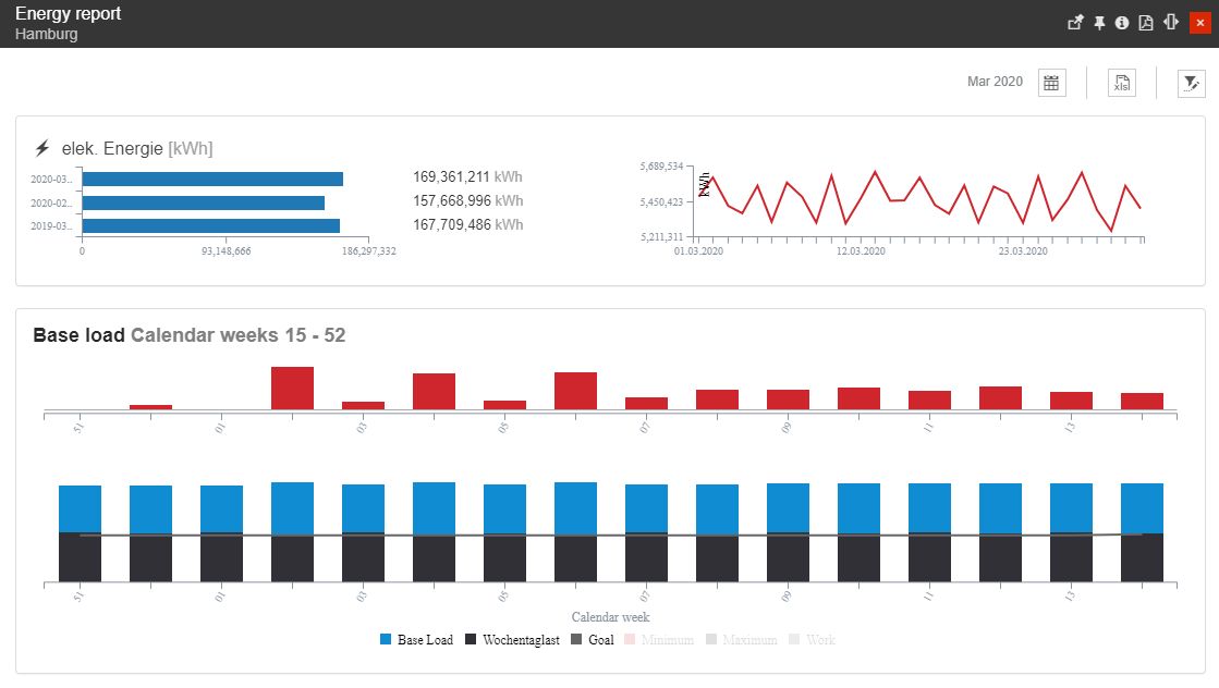
The scope of the Energy report is to provide the user with an overview of the monthly Energy consumption of one single Object entity, spread throughout a selected time frame.
The Energy report toolbar provides the user with the following options:
selection of the Time frame - allows the user to select a custom time frame, by clicking the Calendar button. In this view, the user can select the following time frame combinations:
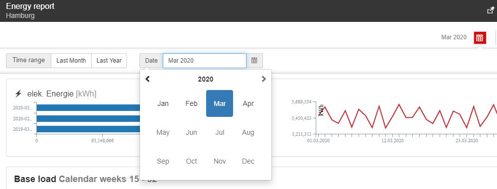
The Time frame selectors
Time range - specific time ranges can be selected, from the following available options:
Last Month - focuses the energy report scope to the past month of the current year
Last Year - focuses the energy report scope to the first month of the previous year
Customized date - enables a customized selection of year and month.
the XLS Export button exports the charted data to an Excel format.
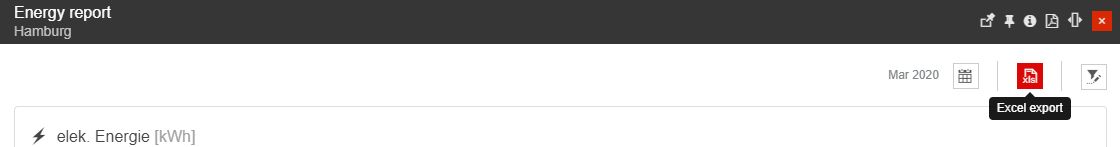
The Excel Export
the Object Filter - allows the user the possibility to select the Object entity by clicking the Open Filter toolbar button. The Object Filter panel allows the selection of one Object only, regardless of its type: Site, Organizational Unit or Area.
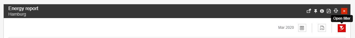
The Open filter button
Having a complex structure, the Energy Report panel displays a set of charts, focusing on the selected Object entity and the predefined time frame, as follows:
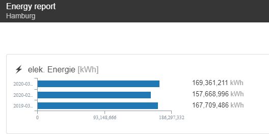
The Horizontal Bar chart
The first element of the Energy report panel is the Horizontal bar chart where the three bars display the following measurements:
The Horizontal Bar chart
the energy consumption measured for the currently selected month;
the energy consumption measured for the month before the currently selected one;
the energy consumption measured for the same month of the past year.
The scope of this chart is to enable a comparison between these periods of time, allowing the user to observe if the consumption has increased or decreased from the past periods.
In parallel with each chart bar, the actual consumption value is displayed. By hovering the mouse cursor over a chart bar, a tooltip is displayed, where the user can read the measurement time frame, the KPI, and the consumption value.
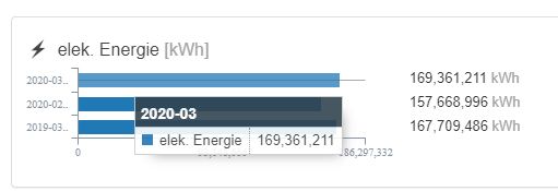
The Horizontal Bar chart tooltip
The Trend chart
Next to the Horizontal Bar chart, the Trend chart is displayed. In this view, the user can follow up on the trends in energy consumption over one single period of time, namely the currently selected month.
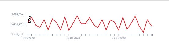
The Trend chart
This chart reveals the fluctuation in consumption, over one month. Hence, a daily overview can be extracted from this chart. By hovering the mouse cursor over the chart, a tooltip is displayed, providing the user with information on the exact date, the KPI, and the consumption value.
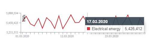
The Trend chart tooltip
The Base Load chart
At the bottom of the panel, a Base Load chart is displayed, where a period of 16 weeks is measured. As discussed in the earlier chapters, the Base Load measures the consumption during the inactivity periods, such as weekends or holidays.
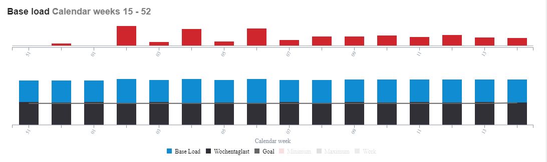
The Base Load chart
The inactivity period consumption evolution is split up into two charts:
the Delta chart is the top dashboard. This chart will quickly display the inactivity periods with higher consumption, spread over 16 weeks, backward from the currently selected time frame.
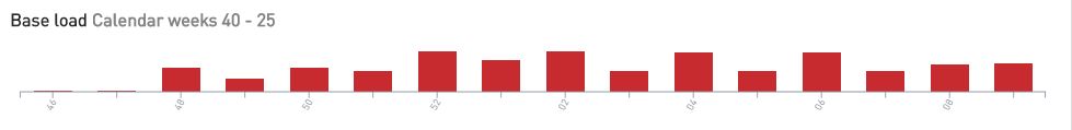
The Delta chart
Hovering the mouse cursor over the chart bars, a tooltip is displayed, providing the user with information upon the Calendar week and the consumption value.
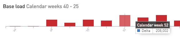
The Delta chart tooltip
the value vs. goal chart is the bottom dashboard. In this view, the consumption during the inactivity periods is compared with the goal values.
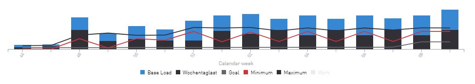
The Values versus Goal chart
For a better overview, the user can activate or deactivate the KPIs, by clicking the bottom legend selectors.
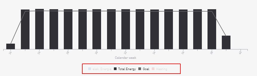
Total Energy and Goal active
The results in this chart can be also reported to the activity periods, by activating the Work legend item.
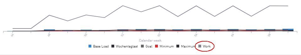
Activity period
For more details concerning the recorded values, the user can hover the mouse cursor over the chart data, until the chart tooltip is displayed.
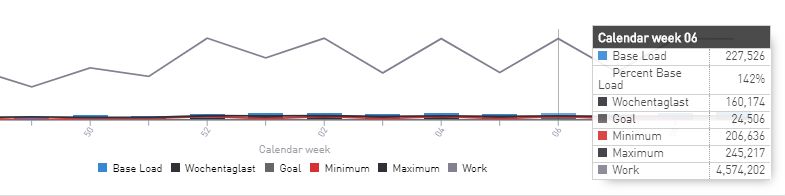
The Value vs Goal chart tooltip